Your truck looks sharp. Your website looks solid.
Then you hand someone a flimsy card and undo all of it.
Roofing business cards are not a formality. They are a first impression that sticks. And it sticks harder than most roofers realize. Studies show 72% of people judge a company’s professionalism based on business card quality alone. That means one cheap card can quietly cost you trust before you ever get a call back.
This is where most roofing business cards fail. Too much clutter. Bad fonts. Glossy logos that say nothing. Cards that look fine but do not convert.
Because a good business card does more than share a phone number. It signals credibility. It sets expectations. It makes someone remember you when three other roofers just left estimates on their kitchen table.
In this guide, we break down 9 design tips that turn roofing business cards into silent closers, not forgettable rectangles.
Tip #1: Design for Trust Before Branding
Most decisions happen in seconds, usually standing in a driveway or kitchen. The card either feels trustworthy or it does not. There is no middle ground.
That is why clarity beats creativity every time. A clear hierarchy matters more than a clever logo. Your name, company, and contact method should be obvious without effort. When a card feels simple, it feels confident.
Roofers who get more callbacks usually:
- Use high contrast between text and background
- Avoid stacked logos and tiny subtext
- Prioritize legibility over “design flair”
Trust is built before branding even has a chance to speak.
Tip #2: Less Information, More Impact
When homeowners see too much information crammed into a small space, it triggers doubt. If you cannot decide what matters most, they assume you may not be decisive on the job either.
A roofing business card should support recall, not educate.
What actually helps homeowners choose later:
- A clear name they remember
- A company name that sounds established
- One frictionless way to reach you
Everything else belongs in follow-up material, not on the card.
Tip #3: Use Fonts That Feel Solid, Not Stylish
Trendy fonts feel playful. Thin fonts feel fragile. Script fonts feel risky. None of those inspire confidence when someone is trusting you with their roof.
Typography research shows that solid serif fonts like Baskerville increase perceived trustworthiness by up to 40% and make statements more believable. Easy-to-read fonts boost trust by 40% and conversions by 35%.
In roofing terms, that means:
- Cleaner fonts = more callbacks
- Better readability = less doubt
- Strong typography = quieter confidence
When fonts disappear, trust shows up.
Tip #4: Color Choices That Signal Professional Roofing, Not DIY
Color decides how you’re categorized before a word is read.
Blue consistently evokes trust and reliability, making it ideal for professional roofing. It has a strong positive effect on quality perception. Orange and yellow often signal speed or low price. That can work for promotions, but it can cheapen perception on a business card.
Consistency matters even more. Consistent brand colors increase recognition by up to 80% and boost revenue by 20% or more for many firms. Around 85% of purchase decisions are influenced by color visuals alone.
This is where your card must align with your truck. If you are already debating the pros and cons of roofing truck wraps, your business card should reinforce that same visual decision, not fight it.

Tip #5: Card Stock Quality Is Not Optional
If you have ever seen that infamous scene in American Psycho where grown adults spiral over card thickness, texture, and finish, that reaction is not exaggerated. Humans really do care that much. Especially when money and trust are involved.
Thin cards feel temporary. Thick cards feel established.
A heavier stock subconsciously signals confidence. Matte or soft-touch finishes reduce glare and fingerprints. Cheap gloss feels like a flyer someone hands out at a gas station.
Homeowners may not articulate it, but they feel it.
If the card feels cheap, the work feels questionable.
Card stock communicates:
- Attention to detail
- Pride in presentation
- Comfort charging what you are worth
Your roofing business card should feel closer to a contract than a coupon. If someone stacks your card next to three others, it should be the one that makes them pause and think, okay, this company takes itself seriously.
Tip #6: Add One Clear Action, Not Five
Most roofing business cards try to do everything. Call. Text. Visit. Follow. Scan. Decide. That overwhelms people.
A single clear action works better because it removes decision fatigue.
Smart roofers choose one:
- Call for inspection
- Scan to see recent jobs
- Text for quick scheduling
This is especially critical if you want to dominate door-to-door roofing sales. Cards are often used hours or days later. One obvious next step increases the chance they act at all.
Tip #7: Make It Easy to Save, Not Just Read
Your card does not need to impress. It needs to survive.
It should be easy to:
- Photograph
- Save in a wallet
- Stick on a fridge
Short URLs, clean layouts, and subtle QR codes help people keep your information without effort. The easier it is to save, the more likely you get the callback.
A saved card is a delayed win.
Tip #8: Match Your Card to Your Truck, Website, and Sales Process
If your truck looks polished but your card feels generic, homeowners notice. If your website looks modern but your card feels dated, confidence drops.
Your card should feel like the same company they saw online and on the street. This alignment reinforces branding for roofers that feels intentional, not accidental.
Consistency builds trust faster than clever design ever will.
Tip #9: Test Your Card Like a Sales Tool
Most roofers never test their cards. They just reorder them.
Treat your card like a sales asset:
- Change one element
- Track callbacks
- Ask new customers how they found you
Conversion for roofing business cards is simple. Did it help you get chosen? Did it make you easier to remember than the other estimates?
If not, redesign it. Your card should work as hard as you do.

Common Roofing Business Card Mistakes to Avoid
Most roofing business cards do not fail quietly. They fail instantly.
These are the mistakes that make homeowners second-guess you before they ever call.
Too much information
If it feels like a flyer, it gets treated like one. Crowded cards look insecure and desperate, not professional.
Cheap card stock
Thin, flimsy cards scream temporary. Homeowners may not say it out loud, but they feel it.
Trendy fonts or gimmicky layouts
What looks “cool” today looks outdated fast. Worse, it can make your company feel unreliable.
Inconsistent branding
If your card does not match your truck or website, something feels off. That disconnect lowers trust immediately.
Multiple calls to action
Call, text, scan, visit, follow. Too many options mean no action at all.
Hard-to-read contact details
Tiny text, low contrast, or cluttered layouts force people to work. They will not.
Generic stock icons and clip art
These cheapen perception fast. A bad icon can undo a good logo.
Your Business Card Is a Silent Sales Rep. Train It Properly.
Every roofing business card is working for you or against you. There is no neutral.
When homeowners compare estimates, they are not just comparing numbers. They are comparing signals. Confidence. Professionalism. Who feels like the safer call. Your card sits right in the middle of that decision.
But here is the part most roofers miss. A great card starts the conversation. Systems finish it.
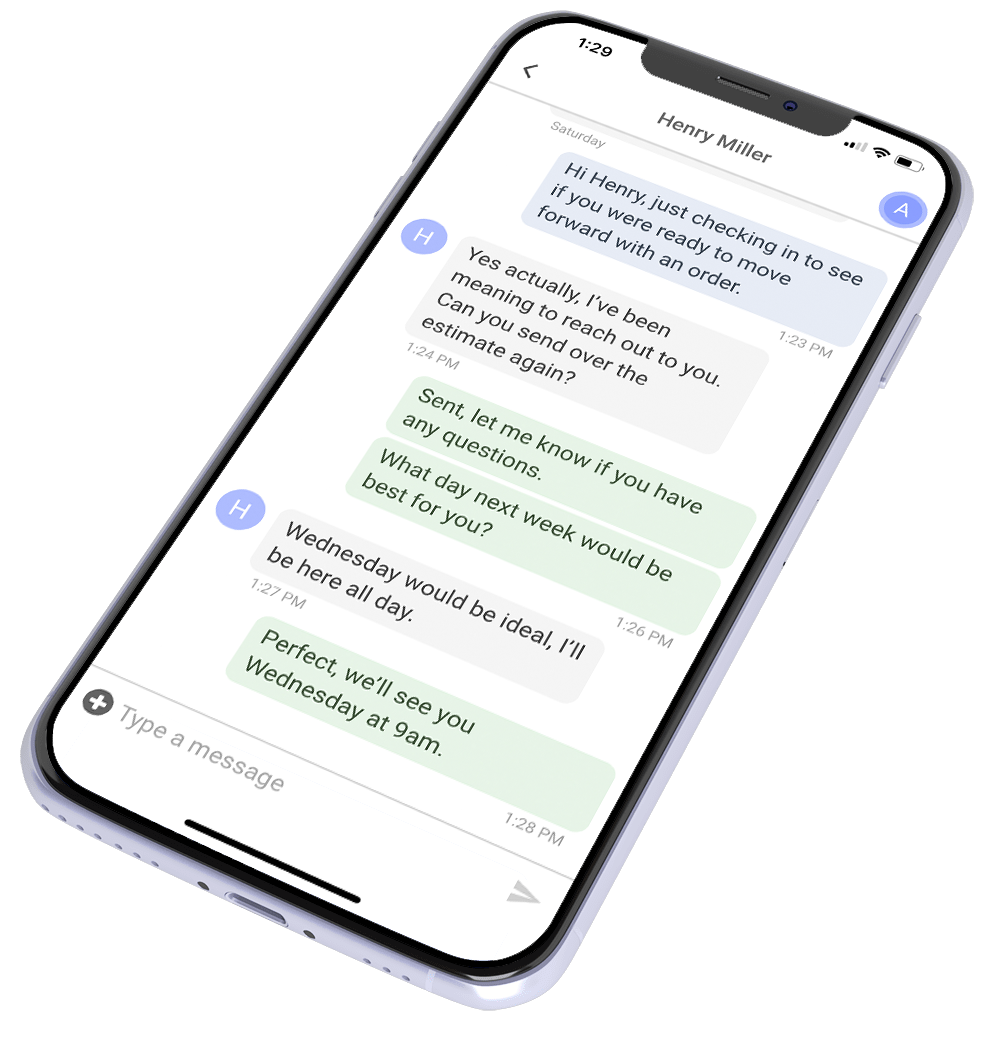
If your follow-up is scattered, your branding is inconsistent, or leads fall through the cracks, even the best card loses power. That is where ProLine comes in. A communication-first CRM built to help you sell more jobs, stay organized, and still make it home for dinner. One place for sales, follow-up, and visibility. No chaos.
Fix the card. Fix the system behind it.
Book a ProLine demo and turn first impressions into signed jobs.
FAQs
Do roofing business cards still matter in 2026?
Yes. Especially because most roofers still use bad ones. A physical card stands out when everything else is digital. It is tangible proof you are real, local, and established.
What information should always be on a roofing business card?
Your name, company name, and one clear way to contact you. Anything that does not help someone call you later is clutter.
What size and finish work best for roofing business cards?
Standard size works best because it fits wallets and card holders. Thicker stock with a matte or soft-touch finish feels more professional and lasts longer.
Should roofers use QR codes on business cards?
Yes, but only one and only if it has a clear purpose. Link it to reviews, recent jobs, or a simple contact page. Random QR codes get ignored.
How do I know if my business card is actually working?
Ask new customers how they remembered you. Track calls from people you met in person. If your card never comes up in those conversations, it is not pulling its weight.