Roofing logos are like a handshake before you ever meet a homeowner. It tells your story, establishes credibility, and sets you apart from every other contractor in your area. In 2026, homeowners make split-second judgments based on branding. A logo that looks clean, professional, and intentional signals reliability. A sloppy, inconsistent one screams chaos.
Think about the last time you hired a service. Chances are, you glanced at a logo, the website, or a truck wrap and formed an opinion before talking to anyone. Homeowners do the same with roofing companies. They decide how professional you are based on how your logo looks.
In fact, most consumers judge a company’s credibility based on its logo. That means a homeowner could decide whether to call you before you even answer the phone. If you offer them a well-designed logo does several things at once:
- Signals professionalism: Clean typography, balanced shapes, and consistent colors tell homeowners you run a structured business.
- Supports trust: A logo that looks polished reassures customers that you care about details, and if you care about your branding, you’ll care about their roof.
- Enhances memorability: When a homeowner talks to a neighbor, they’re more likely to remember your brand if your logo sticks in their mind.
In short, your logo is a marketing tool that works 24/7. If you want a roofing truck wrap idea that won’t fail, you have to design your logo in a way that catches people’s attention.
Just look at this bland image below. It doesn’t say anything. This generic image doesn’t have a message for your clients. Slapping a logo on it will make it a better advertising material.

Elements of a Roofing Logo That Build a Brand
Not all logos are created equal. Some look modern, professional, and memorable. Others feel generic, outdated, or confusing. You don’t have to follow another company’s style if you don’t want it. Your logo can be very funny and quirky if that’s how you want your brand to look. If your goal is to build a brand, focus on these key elements:
1. Strong Typography
Font choice is subtle but critical. A bold, sans-serif font communicates strength and reliability. A handwritten script might look friendly, but it can feel unprofessional on a truck or proposal. If you are using Comic Sans, it makes you look less professional than a roofing company using Times New Roman. Scientists say that fonts influence readability and perception of trust more than color for many homeowners.
2. Iconography That Reflects Roofing
Roof silhouettes, shingles, hammers, and rooftops are instantly recognizable. When paired with clean typography, an icon can make your brand memorable without clutter. A single, simple roofline is often better than a busy graphic, since it scales across trucks, business cards, and online platforms. Your social media marketing will thrive with a logo that has the right icons.
3. Consistent Colors
Color conveys emotion and professionalism. Blue communicates trust and stability. Red signals energy and urgency. Gray and black convey strength and sophistication. Homeowners may not consciously analyze your palette, but consistency across all touchpoints builds credibility. Data says that color consistency can increase brand recognition by up to 80%.
4. Scalability
Your logo must look sharp on a business card, truck wrap, website, or yard sign. Vector-based designs scale without losing clarity. A logo that blurs or distorts at small sizes diminishes trust before you even speak to a homeowner. The same way choosing the wrong name for your roofing company will lead to over $100k in losses, picking a logo that can’t be scaled easily is a bad branding decision.
5. Memorability
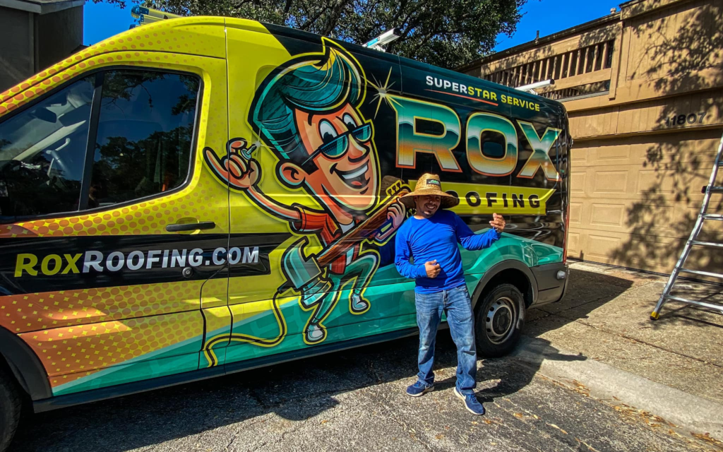
Simple logos stick. Think of your favorite brands. They’re not complicated. For roofing, a bold roofline, a clear name, and a consistent color palette can make your brand stick in homeowners’ minds. For instance, this roofing company below has a cartoon rockstar as its mascot. This mascot appears on their logo. That’s how this roofer has become easily memorable.
If you want to start a highly profitable roofing business, start by choosing the perfect logo.
Rookie Mistakes That Kill a Roofing Logo
Marketing can be really hard for modern-day roofers. Creating the wrong logo can make marketing even harder via lost client trust. Even experienced contractors make basic mistakes with logos that cost leads, trust, and professionalism. Avoid these at all costs:
- Using low-resolution files. A pixelated logo on social media or proposals looks cheap.
- Inconsistent application. Different colors, fonts, or layouts across platforms confuse homeowners.
- Cluttered design. Too many elements make your logo hard to read and forgettable.
- DIY hacks without a plan. Free templates often produce generic, uninspired logos.
- Letting staff modify logos. Random tweaks lead to inconsistencies and diluted branding.
When your branding is inconsistent, homeowners question your attention to detail. That’s where ProLine becomes a lifeline. You can store logos, photos, templates, and proposals in one organized system so every touchpoint looks professional and consistent.
Integrating Your Logo Into Every Aspect of Your Business
Your logo isn’t a one‑and‑done graphic you slap on a truck. It should live everywhere your business interacts with homeowners… and the roofers that do this well show how consistency builds trust and recognition. Here’s how top roofers integrate their logo across their business:
- Proposals and estimates. Placing your logo in the header of every proposal shows homeowners you operate with structure before they’ve signed a contract. A clean logo alongside your contact details instantly makes documents look official and trustworthy.
- Invoices and receipts. Even after the sale, a consistent logo reinforces professionalism. When homeowners keep these documents for records or future warranty claims, your branding stays top of mind.
- Yard signs and vehicle wraps. Roofers like those featured by branding designers often use roofline icons and bold type on yard signs and vehicles to make their logo instantly recognizable in neighborhoods, and that familiarity breeds trust when other homeowners see you at work.
- Website and online profiles. When the same logo appears on Google Business Profiles, social media, and your website, it reassures visitors that your company is legitimate and consistent. Imagine a homeowner seeing your logo on your site and on a truck in their neighborhood. That repetition builds credibility without words.
7 Designs That Signal Trust and Authority
1. Simple Roofline with Bold Typography
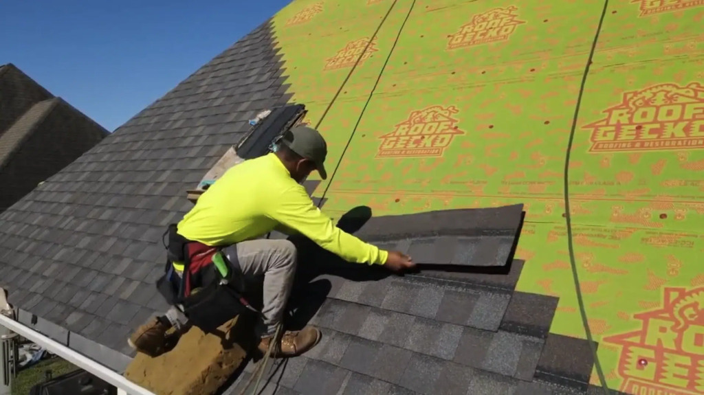
Clean roofline icons paired with strong, readable text make it immediately obvious what your business does. This approach is widely used because it says “roofing” without complexity. A great real-world example is Roof Gecko, whose logo has a gecko on top of a roof.
2. Trustworthy Color Combinations
Using color intentionally signals quality and stability. Blues and grays communicate professionalism and trust better than chaotic palettes. Even large industry brands like GAF Materials Corporation use a bold but simple logo with a strong color scheme that’s instantly recognizable and trustworthy across many platforms.
3. Balanced Icon + Wordmark
Pairing a simple roofing icon with your business name can make your logo work effectively on trucks, yard signs, and proposals. Indy Roof & Restoration employs this tactic with a stylized roof and dependable typography that feels both modern and credible.

4. Memorable Illustrative Elements
Distinctive imagery (like a mascot or a unique symbol) can make a logo stick in a homeowner’s mind. We mentioned earlier how Rox Roofing uses a bold character icon to catch attention and stay memorable while still reinforcing the roofing theme.
5. Sophisticated, Timeless Design
A sleek, minimalist logo with refined colors and clean lines signals maturity and expertise. Class Roofing’s logo is a solid example: it uses a restrained palette and modern aesthetics to project a premium feel. Not to mention that anthropomorphic hammer with a tophat saluting viewers.
6. Strong Symbolism
Incorporating meaningful symbols like shields, houses, or roof peaks reinforces what your business stands for. Companies like ECO Commercial Roofing use an urban skyline and geometric shapes to communicate their commercial roofing expertise clearly and confidently.
7. Modern and Minimalist
A clean, simple design with minimal elements can convey confidence and contemporary professionalism. TrueWorks Roofing employs bold, uncluttered text with a strong contrast palette that works equally well online, in print, and on jobsite signage.
Build a Roofing Brand That Stands Out
You should combine a strong logo with clear communication, professional workflows, and technology like ProLine, and your branding becomes a lead-generating, trust-building, competitive advantage. That’s how roofing companies win more jobs, earn better reviews, and grow faster than competitors who treat their logo as an afterthought.
If you want your branding and business to be organized, professional, and credible from day one, storing and managing assets through ProLine is the easiest way to make that happen.
Your logo, your communication, and your workflow will all work together to close more jobs… and help you get home for dinner. So, book a ProLine demo and start selling more jobs.
FAQs | Roofing Logos That Build Brands
Can I DIY my roofing logo?
Yes, you sure can, but professional logos perform better. A clear, simple, & consistent logo conveys professionalism that DIY templates rarely achieve.
How often should I update my logo?
Minor updates are fine every 5 to 7 years to stay modern because frequent changes confuse homeowners and reduce brand recognition.


